You might think improving conversion rates is solely about marketing, but effective UX design plays a crucial role too. By focusing on how users interact with your site, you can create a seamless journey that encourages them to complete desired actions. Simplifying navigation and ensuring visual consistency aren't just aesthetic choices—they're strategic moves to reduce friction. A well-thought-out checkout process can make or break a sale. Want to learn how to fine-tune these elements and use A/B testing for continuous improvement? Let's explore the vital components of UX that drive business success.
Understanding User Behavior
Grasping user behavior is crucial for enhancing your website's user experience and boosting conversion rates. By understanding how visitors interact with your site, you can identify friction points and optimize the user journey.
Start by analyzing data from tools like Google Analytics or heatmaps to gain insights into where users spend their time and where they drop off. This data helps you pinpoint what's working and what needs improvement.
Pay attention to metrics such as bounce rates, session duration, and pages per session. High bounce rates might indicate that your content isn't resonating or that your site's layout is confusing. Conversely, lengthy session durations suggest that users find your content engaging.
With this information, you can make informed decisions about design adjustments or content strategies that align better with your audience's needs.
Create user personas to guide your design process. These fictional characters represent your different user types and help you visualize their goals, challenges, and behaviors. By doing so, you can tailor your site's experience to meet the expectations of your target audience effectively.
Conduct regular usability testing to gather direct feedback. Encourage users to navigate your site and observe where they face difficulties. This hands-on approach gives you valuable perspectives that quantitative data mightn't cover.
Streamlining Navigation Paths

Once you understand user behavior, it's time to focus on streamlining navigation paths to enhance the user experience on your website. Optimizing navigation ensures users find what they need quickly, reducing frustration and increasing conversion rates. Here's how you can achieve this:
Start by simplifying your menu structure. Remove unnecessary options that clutter the user's journey. Users appreciate straightforward paths that guide them seamlessly to their destination. A clean, well-organized menu makes it easier for users to locate essential information without confusion.
Consider implementing a search function, especially if your site has a lot of content. A robust search bar empowers users to find specific items directly, saving them time and effort. Additionally, ensure your search function is visible and intuitive.
Here's a quick reference to help you streamline navigation:
| Strategy | Benefits | Implementation Tips |
|---|---|---|
| Simplify Menu Structure | Reduces user confusion | Limit menu items to 5-7 |
| Breadcrumb Trails | Enhances orientation and navigation | Use on pages with multiple levels |
| Search Functionality | Speeds up content retrieval | Place prominently on all pages |
| Consistent Layout | Builds familiarity | Uniform design across all pages |
Breadcrumb trails can further enhance navigation by showing users their current location and path within your site. They're particularly useful on sites with multiple levels of content, reducing the likelihood of users getting lost.
Lastly, maintain a consistent layout throughout your website. Consistency builds familiarity, allowing users to predict where they'll find information on different pages, creating a smoother experience. By implementing these strategies, you'll guide users effortlessly, leading to higher satisfaction and improved conversion rates.
Enhancing Visual Appeal

Captivate your audience by enhancing the visual appeal of your website, as first impressions significantly impact user engagement. You have a mere few seconds to make your visitors feel at home, and the right design choices can make all the difference. Here's how you can enhance your site's visual appeal effectively:
1. Consistency is Key: Ensure your design elements are consistent across all pages. This includes fonts, colors, and button styles.
A unified appearance not only boosts professionalism but also helps users navigate your site more intuitively. It reduces cognitive load, allowing users to focus on the content and actions you want them to take.
2. Prioritize Readability: Choose typography that's easy to read and complements your brand's tone.
Consider line spacing, font size, and contrast with the background to improve readability. A visually appealing text layout invites users to engage with your content and absorb information readily.
3. Use High-Quality Visuals: Images, videos, and graphics should be high-resolution and relevant to your content.
They should load quickly, as slow-loading visuals can frustrate users. Optimize file sizes without sacrificing quality to maintain fast loading times. Engaging visuals can highlight key product features and evoke emotional responses, driving users to convert.
Simplifying Checkout Process

Streamlining the checkout process is crucial to reducing cart abandonment and boosting conversion rates. When customers reach this phase, they've shown intent to purchase, so don't let a complex, tedious process deter them.
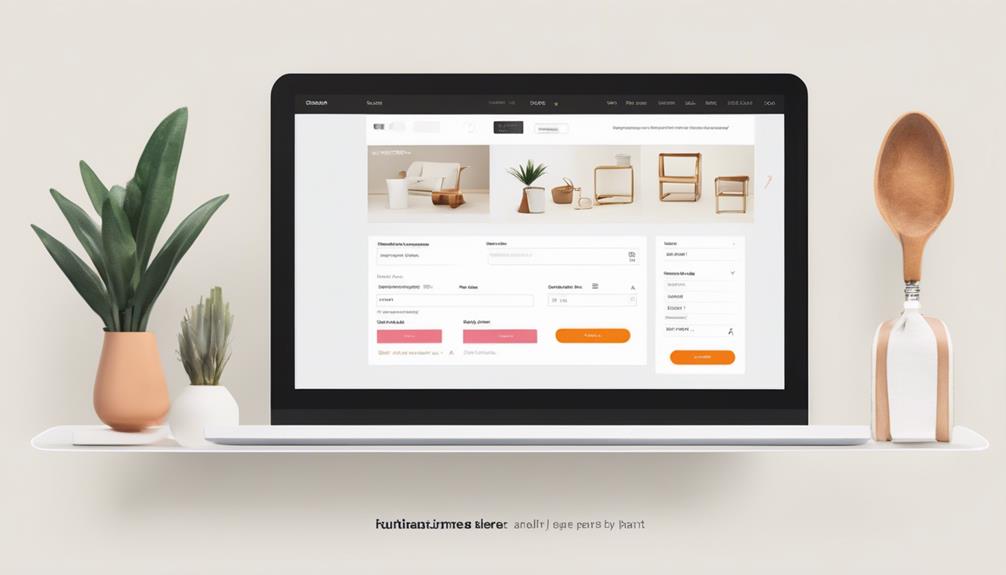
First, minimize the number of steps required to complete a purchase. Keep it as simple as possible—consider a single-page checkout that displays all necessary fields and information at once. This reduces the perceived effort needed to complete the transaction.
Next, offer a guest checkout option. Forcing users to create an account can be a major turn-off, especially for first-time buyers. By allowing them to check out as a guest, you respect their time and privacy, which can increase the likelihood of them completing the purchase. Capture their details post-purchase for future marketing efforts.
Ensure your forms are intuitive. Use clear, concise labels, and organize fields logically. Implement real-time validation to reduce errors and frustration. If a mistake occurs, provide helpful error messages that guide users to correct it without ambiguity.
Payment methods should be diverse and secure. Offer popular options like credit cards, PayPal, and digital wallets to cater to varying customer preferences. Display security badges to build trust and reassure users their information is safe.
Lastly, show progress indicators. Let customers know where they're in the process and how much is left. This transparency can ease anxiety and keep them committed to finishing the transaction.
Implementing A/B Testing

After simplifying your checkout process to enhance user experience, it's important to continuously optimize your design through A/B testing. This powerful tool allows you to compare two versions of a web page to determine which one performs better. By making data-driven decisions, you can increase conversion rates and improve overall user satisfaction.
To get started with A/B testing, focus on these key steps:
1. Identify Elements to Test: Begin by pinpointing which elements might impact user behavior. It could be headlines, call-to-action buttons, images, or even the color scheme.
Keep your tests simple and focus on one variable at a time to clearly see what works.
2. Set Clear Goals: Define what success looks like for your test. It might be a higher click-through rate, more sign-ups, or increased sales.
Clear goals help you measure the effectiveness of your changes and ensure that you're moving in the right direction.
3. Analyze Results: Once your test runs, analyze the data to see what's working. Use tools like Google Analytics to track performance metrics.
If one version significantly outperforms the other, you've got actionable insights to implement site-wide.
Conclusion
By focusing on user behavior and streamlining navigation, you create a smoother journey for your customers. Remember, "the devil is in the details"—so enhance visual appeal and simplify the checkout process to eliminate friction points. Use A/B testing to refine these elements, ensuring your design evolves with user needs. A well-crafted user experience not only fosters engagement and builds trust but also boosts conversion rates, driving your business towards greater success.


Leave a Reply